Jan 29, 2021
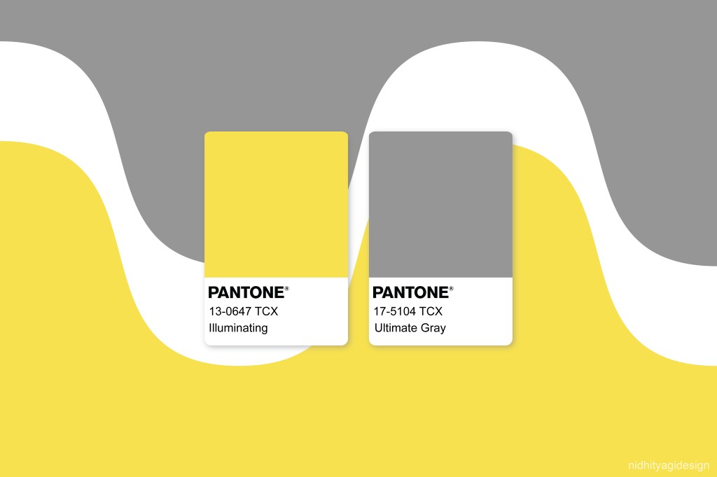
Every industry related to design including products, apparel, textiles, accessories, cosmetics, interior and graphics looks forward to the reveal of Pantone color of the year by Pantone LLC, which is known for a standardised colour matching system through Pantone Guides and shade cards with specific numbers assigned for each colour chip. On 9 Dec’20, Pantone announced its Colors of the Year for 2021: 17-5104 Ultimate Gray and 13-0647 Illuminating. The combination of bright yellow and classic gray symbolising hopefulness and strength in times where unrest and uncertainty are prevalent socially, economically, financially and politically across the globe.
“A combination of colour whose ties to insight, innovation and intuition, and respect for wisdom, experience, and intelligence inspires regeneration, pressing us forward toward new ways of thinking and concepts.” (Pantone)
Though many people were optimistic about the two colours, it wasn’t very well received by a lot of others. After a brief analysis, I was able to point out three major reasons for the backlash.
Reason 1: Done-to-death combination
Designers and brands, both the well-established and the upcoming ones, turn to Pantone for inspiration and guidance regarding colour trends and predictions. The combination selected this year has been used many times previously, especially throwing back to the 2000s when yellow and grey chevrons became quite popular. This has been seen quite frequently and feels outdated. The only last time Pantone introduced two ‘Colors of the Year’, were in 2016 – Rose Quartz (shade of pink) and Serenity (shade of blue), a fresh and versatile combination. It was everywhere. Now, on comparing this year’s colours to that of the 2016’s, it lacks the unpredictability of the pairing. It is too safe and the surprise factor is missing.
Reason 2: Doesn’t justify the explanation well
The reason for selection that it’s an optimistic combination feels somewhat pretentious, confusing and bland since the grey is associated with stability as claimed but at the same time, it is dull, depressing and boring. Without any undertone to it, it is artificial and unnatural. To a few, it may seem average, too generic or probably timeless to even be considered a trend. Moreover, the vibrations of these colours are not reflecting and resonating with the mood. Some are not convinced that it evokes happiness and argues that illuminating yellow would have been enough to convey that message. To others, it looks very industrial or corporate in a not-so-good way. Well, not many people would want to see ‘concrete’ shade grey walls during their quarantine period while bright yellow is best suited as accents/highlights in just small portions in interiors otherwise it has a tendency to be irritable. Some feel that yellow is a bad choice since it is associated with illness and anxiety. Different people have different reasons, but mostly it is being seen as purely marketing-driven symbolism which does not justify the selection convincingly.
In Vogue’s article titled ‘Pantone’s Color of the Year Is Really Weird—Just Like Everything Else Right Now’, it states that this feels wishy-washy and vague and wished Pantone had picked something more meaningful. (Vogue)
Reason 3: Colour Accessibility issues for UX design
According to the accessibility standards, it is not a good pairing for websites, applications or digital interfaces since it does not pass the colour accessibility standards. There are various parameters to determine accessibility and considering the contrast between these two tones, it won’t really work unless used extremely strategically or with other colours. A good source for the topic here.
Interpretations
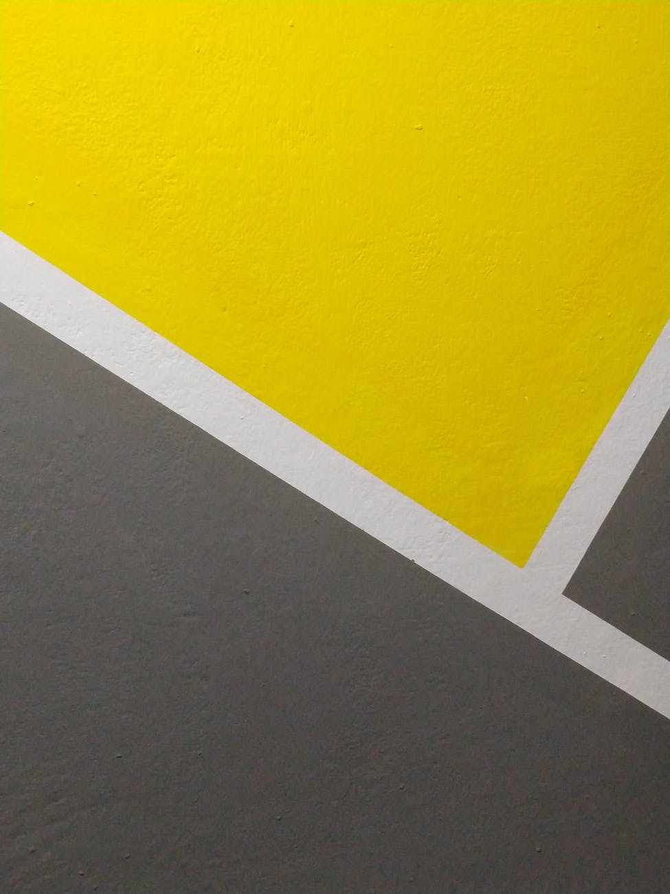
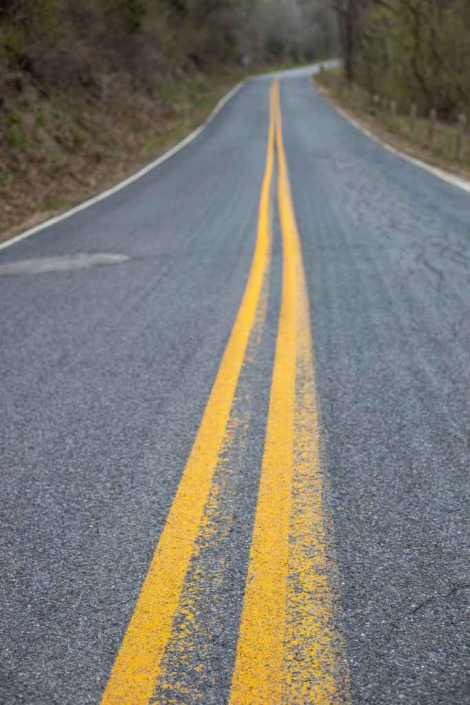
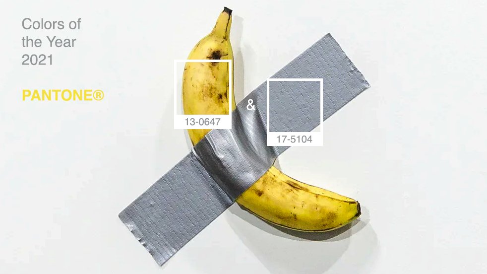
The colours ended up being compared to a spectrum of things, from the road markings and danger signs to taxis and hornets, the most popular comparison being the viral Maurizio Cattelan’s notorious banana sculpture Comedian from last year’s Art Basel Miami Beach.
From another perspective, freshly interpreting this combination in a totally different light can be a good challenge for the designers. The Pantone Color of the Year is picked after a lot of discussions and analysing of the selections from each angle by representatives who gather from different countries. Whether anyone agrees with the points above or not, there is no denying that a few are also in favour of it and you will see more of it in the coming year. The internet has already started flooding with yellow and grey patterns, images and products, considering the initial exposure where everyone wants to put in their vision of the usage of colours in their products.
How it might actually end up…
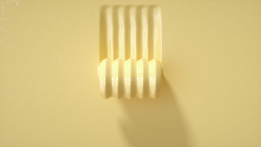
My takeaway is that the combination is right, just not these particular shades. The softer ‘Butter Yellow’ (Coloro 040-86-20) suggested as one of the five key colours by WGSN in collaboration with Coloro for the season SS’22 works way better. It is a very refreshing shade, cheerful yet not visually harsh. It is neither a primary yellow nor the typical pastel pale-yellow, just somewhere in between the two and works perfectly. It is much more likeable. Due to its pleasantness, very few people will have any sort of aversion to it, unlike the stark Illuminating yellow. It can be used abundantly and is very versatile, hence easy to team up with other colours. The shade could further transition towards a saturated ochre for the autumn-winter season.
The hard mid-tone grey could have been a natural one with a blue or green undertone, perhaps a few shades lighter/darker to have a beautiful contrast with the yellow.
In Fashion, butter-yellow is already an emerging colour this season and grey has stuck around for a long time being a classic, mostly in the form of the popular grey-marl fabrics that the majority of brands have always used. Hence, ultimately the chances are that there would be extensive use of this combination in the coming months, but with variations in the shades of 17-5104 Ultimate Gray and 13-0647 Illuminating, keeping the message of optimism and fortitude, as Pantone predicted, secure.
Colour schemes are extremely crucial for brands. Now, you can schedule a session to know more about how you can successfully integrate this tricky pairing of Pantone Colors of the Year 2021 in your palette for this year so that it works for you.

Leave a comment