Dec 05, 2022
Pantone has been on the forefront when it comes to colour trend forecasting and recently, its Color of the year 2023 was released. It is vouching for the saturated berry shade Pantone 18-1750 Viva Magenta. “It’s brave, it’s fearless, it depicts optimism and joy – and we know that we are all greatly in need of that,” says Leatrice Eiseman, executive director of the Pantone Color Institute. (The Guardian). She further states that it is inspired by the red of cochineal, one of the most precious dyes belonging to the natural dye family as well as one of the strongest and brightest the world has known. (Pantone)
Upon analysing the current trends and direction, the colour looks promising. Dopamine-inducing shades has been in trend since a couple of seasons now. Specifically during Fall-Winter’21, stark and clashing combinations of saturated complementary colors like tangerine and blue, red and green etc. were everywhere, from runways to graphics. Moving forward, the inclusive and innovative Viva Magenta can be seen as an extension of these saturated palettes, and at the same time, has the ability to get along with neutrals effortlessly.
Evolution of Pinks in the last decade
Via Magenta belongs from the red family. To grasp the influence of shades of red over these years, I consider important to highlight the various pinks that have been significant in the last decade, and discuss their respective trajectories. 3 Pinks prominently stands out – The Millennial pink, Pantone’s Rose Quartz, and the latest Valentino Pink or Pink PP.

Millennial Pink indicates a complete range of pink which includes soft tones like baby pink and muted salmon, and not a specific shade. The trend began around late 2000s during the rise of social media when the millennial generation started subconsciously gravitating towards these pinks. Millennial Pink is pleasing, gender-fluid and versatile which can partially explain its abundant appearance, although there is no core theory to justify millennial’s inclination towards it.

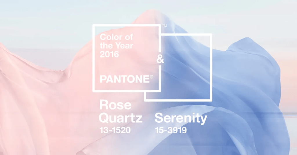
Next comes one of the Pantone’s Colors of the year 2016 – Rose Quartz, the other being a soft baby-blue called Serenity. One can argue that it is just an adaptation of Millennial pink but here, it is a specific shade (Pantone 13-1520). Infact, I would consider this as one of the most successful Pantone Colors-of-the-year. Serenity and Rose Quartz were widely used across categories for more than 3 seasons, both individually and as a combination. It was eventually replaced with fuchsia and pastel candy-pink when brighter colour palettes came in trend.

The most recent and probably the most influential colour of the season was a hot pink brought to the forefront by Creative Director Pierpaolo Piccioli’s collaboration with Pantone Color Institute for Valentino AW’22-23. The collection was based on this single colour, Valentino’s Pink or Pink PP – a fluorescent version of pink radiating an experimental spirit. With Barbiecore becoming mainstream, Valentino’s Pink spread like wildfire. PP Pink was spotted on personalities such as Zendaya, Kim Kardashian, Anne Hathaway, and Sebastian Stan, and on the red carpets of Cannes Film Festival and the Oscars. Additionally, celebs like Ranveer Singh and influencers like Masoom Minawala sported this shade flawlessly.
Now…
..after the criticisms surrounding Pantone colours-of-the-year for 2021 followed by a moderately convincing selection of 2022’s Veri Peri, Viva Magenta does reflect the zeitgeist of the period accurately. The assertive yet unimposing Crimson tone has an energising effect, and depicts a meeting point between the warm and the cool shades.
In hindsight, it appears that Viva Magenta will be adopted, embraced, and used widely across industries, especially fashion, in the coming seasons.
For consulting and design directions, reach out here.
(Featured Image Courtesy: Pantone)


Leave a comment